
I’ve aready written two short articles about my first date with Wickeditor (here and here).
I described the purpose, advantages andrestrictions of Wickeditor – the tool that allows you comparatively easily to create animated web experience on your website, including WordPress. And now I want to share a piece of something practical now.
There are some sources, practical guides and available projects. By looking at them you can get the basics and more advanced knowledge of what and how you can do with Wickeditor. I’d like to give you a short tutorial on how to create a custom animated clickable image which may be considered as a fancy button.
I used this technique in my first Wickeditor project (see below) to create clickable animated elements (the planet and the rocket, click the planet to start):
You can download the Wickeditor project (.wick file) here.
In this tutorial I will also call my project “game”.
Some principles that I used for my Wickeditor project
This section can be useful to you if you are not familiar with Wickeditor and similar tools based on layers. For example, Synfyg, Adobe After Effects or Adobe Flash if you are a dinosaur like me. If so, then let me outline some of the principles that you need to be aware of when diving into Wickeditor.
This is not the entire theoretical prerequisites that you need to know to work with the software. This is just some concepts in shorts that good to be aware of to understand my small Wickeditor tutorial (and other Wickeditor tutorials as well).
Principle of layers
Wickeditor works with assets. One of the types of the assets (the one I’ve built my project upon) is image. For example, here are some of the image assets I have:
- Background image (with normal planet and rocket)
- Image of the planet highlighted with purple color
- Image of the rocket highlighted with purple color and one more rocket image highlighted with yellow color
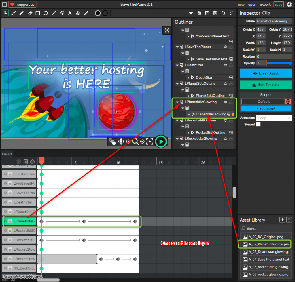
Each asset (image) takes its own layer. Layers can be animated (moved, change opacity etc)
By manipulating these layers you can create animated interactive experience.
For example, I made animated glowing planet by just putting a new layer with the highlighted planet on a background image with the normal planet, and by changing the opacity of this new layer in loop. It created an effect of a glowing planet. Like this:
Layers can be placed one on another. Objects in layers can move and change their properties (e.g. size, opacity, color, shape, etc).
By the way, due to specifics of the software (perhaps bugs or lack of functionality, or maybe my crooked hands lol), it can be useful to use dummy (or fake) layers. Fake layers may seem like redundant from the first glance, but they can be used to catch user’s actions (e.g. to catch events when a user click on some areas).
I use dummy layers to catch the events on the objects which disappear and appear in loop when being animated. The animated objects themselves can not catch the events for some reason. So I use transparent layers above the objects which should be clickable. If it sounds confusing, no problem, you will understand it later in the tutorial.
Here’s an example of three layers that I use for animating the glowing planet by dynamically changing opacity and for catching the user events (e.g. clicks)

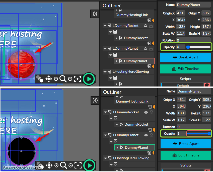
A dummy element is just a transparent shape (the element drawn with Wickeditor drawing tools and with opacity = 0).
The same approach of using at least three layers (1 – background, 2- animated, 3- clickable transparent) for interactable elements I use for the rocket and for the final text “You better hosting is here”.
Principle of events
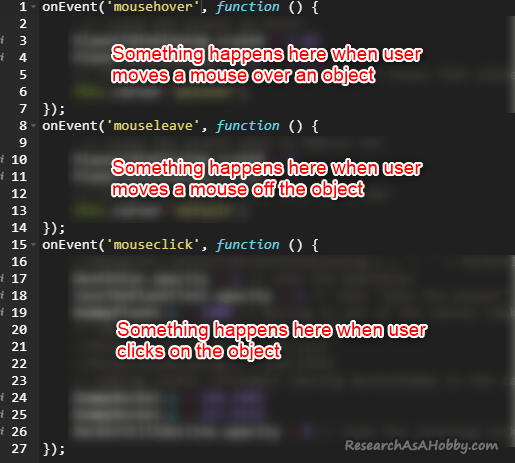
Wickeditor is based on Javascript. If you are not familiar with it, no worries. The point is that objects (e.g. images) can interact with. For example, objects can be clicked, dragged, there can be text input from a keyboard, etc. In order to trace these user’s actions there are events.
When an event happens (e.g. user makes some action like clicking), something happens (e.g. one image disappears, and another image appears). This requires writing a bit of code, but it’s quite simple, you don’t need to be a coder to deal with it.
For instance in my small project I use three events:
- mouse hover (when a user moves a mouse over the object, e.g. image, and something happens , e.g. the image increases in size or other image appears).
- mouse leave (when a user moves a mouse out of the object ,e. g. image, and something happens, e.g. the image backs to a normal size, or hides the image that appeared when mouse hover event worked).
- mouse click (when a user clicks on an object, e.g. image, and the image reacts, e.g. the image increases in size or other image appears).
Of course, this is not the entire list of all the events possible in Wickeditor. I just outline the one I used in my project, so that to prepare you for the following parts of my tutorial 🙂
Principle of a limited canvas
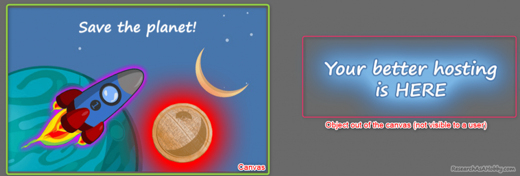
This is rather a trick than a principle, but anyway. I use it in my project so I’m telling you about it. Sometimes you want to hide or to show an object (e.g. an image). And the simplest way to do so is to move the object out of the canvas (it will not be visible to a user). And when you need it (e.g. a user clicks something), you set the location of the object so that the object goes into the canvas (the visible area). Plus you manipulate opacity of the object and finally it looks like the image appeared or disappeared on a user’s screen.
Storyboard, or making a picture of what you want
Before getting to the tutorial itself, I’d like to show you the preliminary steps I’ve done. It will help you understand the tutorial better.
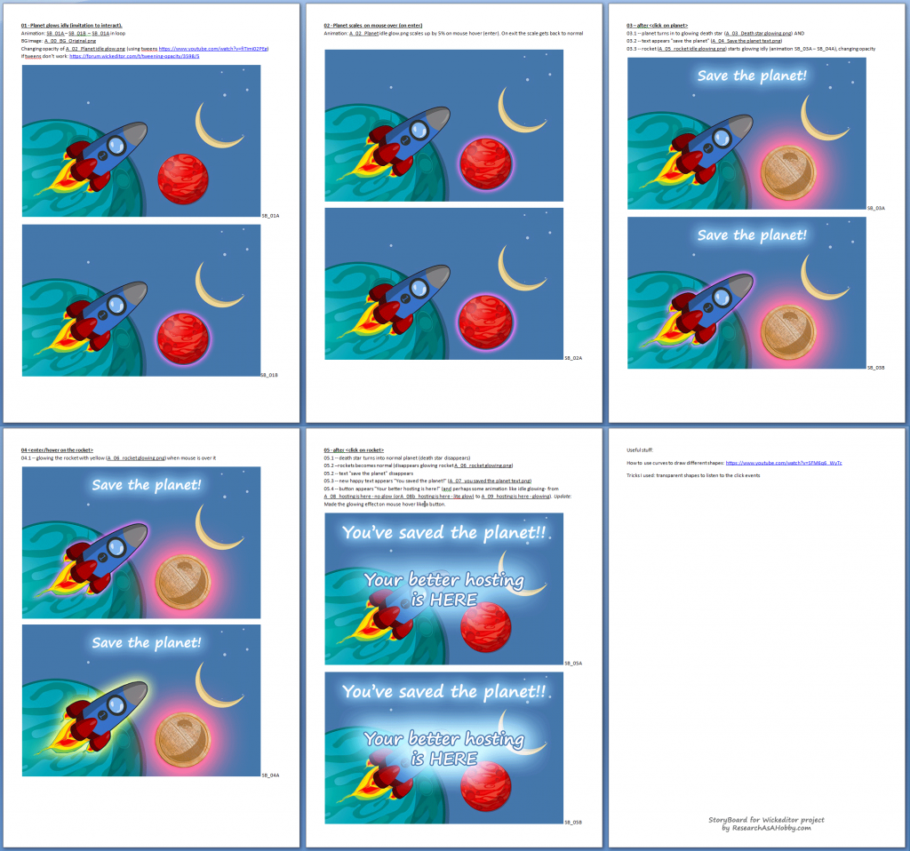
In animation as well as in software development a storyboard plays a huge role. It helps to visualize your ideas before you go to a production phase which can be pretty expensive. You don’t want to re-do and re-think the idea you input in your project during development. Story board helps you to minimize it.
And since my project includes multi-step user actions and animations, it was a good idea to make a clear picture of what exactly I want my project to have.
There’s no just one way how storyboard should look like. The overall idea is to present multiple steps what happens on user screen within time or depending on user’s actions.
In my case I was browsing across free pictures on pixabay.com looking for something that would be both simple for editing (I knew I wanted to make assets as I wanted animation in my project) and could tell some story. After finding an appropriate image, I came up with a story I want to make interactive and animate.
First, I thought of a rich animation project with multiple storylines. But after I started to make a storyboard I realized how much work it involved. So, on this stage I decided to make my project short. With a shorter project there were more chances to finish the project and make it work. Yeah, this is how I’m learning to harness my perfectionism 🙂
After creating a draft of the storyboard, I made image assets (read next section about it). Including the names of the image files into the storyboard made it easier for further project development. Also I added some notes regarding the Wickeditor functionality as I found them by exploring the web to help myself in future working on the project.
I did not polish the storyboard as I did not need anyone to understand it. The main purpose of it was to make the process of development easier for myself.
This is how a final revision of my storyboard looked like (you can click to enlarge):
Creating assets for Wickeditor project
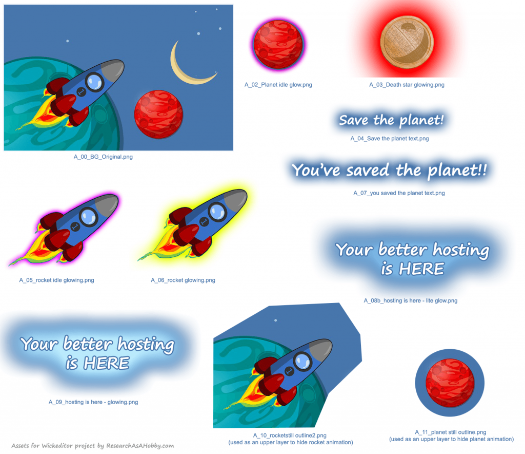
When putting together the storyboard, I understood more or less what kind of project I’m going to make. It let me understand what assets (images) I need. These elements are separate objects that I will manipulate by setting opacity, position and handling the user actions (e.g. clicks) to create interactivity.
For example, I have the following assets for the planet’s role:
- Normal state of the planet (did not need it, as I used the image of a planet at the main background image)
- The planet glowing in purple
- The death star planet with a glowing effect
Likewise I have several assets for the rocket, as well as multiple assets of text with and without highlighted effect.
Here’s the collection of the image assets I used:
Working in Wickeditor
General overview
I used a web version of the tool. I believe it’s developed and supported in the first priority compared to the stand-alone version.
If you want to create your Wickeditor project, I’d recommend looking at the educational resources I listed here. They will give you a feel of the tool, as well as you can find how to do some basic (or not so basic) things in the tool.
In this tutorial I’m focusing mostly on the things that I used for my project.
Here’s the overview of Wickeditor’s user interface:
A common process of working in Wickeditor for my project was like this:
- Add assets (e.g. images) you need to the asset library
- Add a new layer
- Add assets (images) to a layer or draw something in the layer
- Set up the animation for the elements within layers
- Set the properties of the assets, including scripts (events handling and collaboration with other elements). Add dummy elements if needed for events hanlding
- Add another layer, and so on
I used one layer for each asset (image) in my project:
In your case it can be differently. In my case the number of layers was not large, so I did not consider optimizing it.
I placed all the elements on the canvas as they should appear for the user when the game starts. The only exception is “You better hosting is here” text. Although it’s visible I nthe edit mode, right on the game load I programmatically move it off the canvas.
The scripts in my projects are located only for the elements in the dummy layers. Only these elements interact with user (i.e. catch user’s clicks, mouse hover, mouse leave events).
My project has four core things:
- Moving some elements on (off) the canvas to make them (not) visible/available.
- Setting the animation of elements (e.g. glowing effect).
- Handling events (user’s actions which are mouse clicks, mouse hover and mouse leave).
- Also, as I’ve mentioned, I use dummy layers as transparent overlay layers to handle user’s actions.
These were the ingredients of the sauce I used in my project.
Now let’s see these “secrets” closer.
Before going to scripts in the sections below, here are some general notes:
- Only the intractable elements (located in the dummy layers in my project) have scripts.
- There are two types of scripts I use:
- 1. Scripts which run right after the game starts (default section in Wickeditor’s script editor)
- 2. Scripts which run on events (in my project they are clicks, mousehover, mouseleave)
How I made transparent dummy elements
As I’ve mentioned above, I use dummy elements to catch user’s actions (mouse events). The dummy elements are just transparent simple shapes overlaying the image elements in the canvas. Transparent means opacity set to 0. On the image below for demonstration purposes I set dummy element’s opacity to 1 to reveal the shape:
But even totally transparent Wickeditor shapes still catch users actions (clicks etc). Custom elements (my image assets) for some reason do not catch user actions when being transparent. That’s the reason why I used dummy elements.
When the game starts (scripts in the default sections)
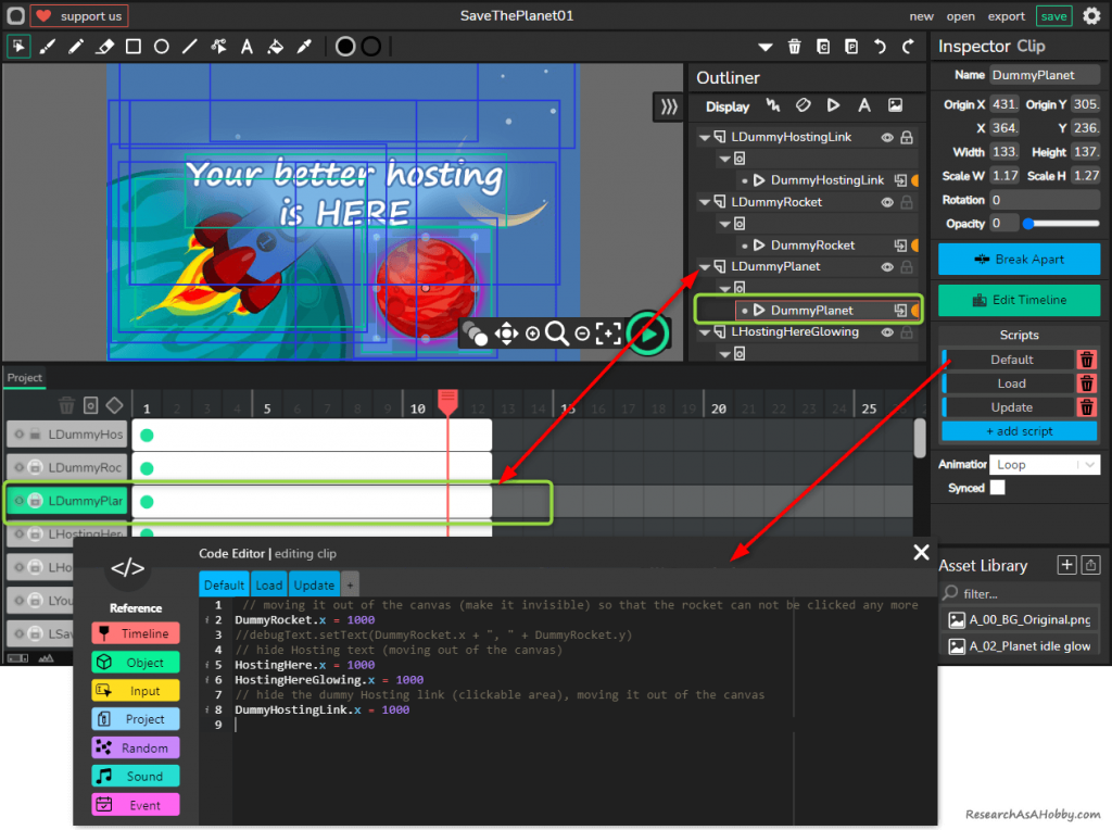
Let’s look what I wrote in the default scripts (which run right after the game starts). I have the default scripts only in one place – in the DummyPlanet element:
The comments in the script explain it all. So, here’s also just a short resume: the default script prepares the game for a user. As when editing I put all elements in the canvas, some of the elements should be moved away from the canvas. These elements will be moved into the canvas (and will become visible to a user) later as use interacts with the game.
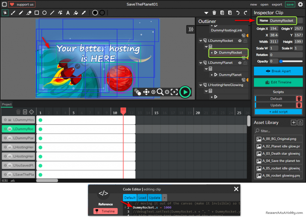
Also, the names of the variables in the script are the names of the elements used in the layer:
Animation in loop of elements (glowing effect example)
In this section I will explain how I made a glowing effect (the planet and the rocket inviting the user to interact).
The principle is very simple. Animation is done with just two layers. The first one is a static background, and the second is an image with the glowing effect. The second layer has a looping animation of changing opacity from totally transparent to normally visible. This creates the glowing effect.
For the animation of the opacity property I use tweening (Wickeditor animation feature):
Also, here’s a short video tutorial on tweening from Luca Damasco, one of the Wickeditor’s developers:
I made a glowing animation of the rocket the same way.
I did not animate the third interactive element in my project, the text “Your better hosting is here”. I just set up a script on mousehover which replaces the image with the text and scales it a bit to imitate the interactivity (more on this in the next section).
Scripts on handling events (mouse hover, mouse leave, clicks)
Planet interaction
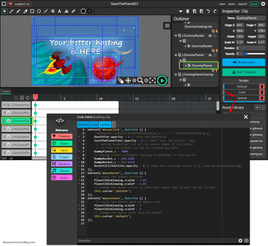
Here’s the screenshot of the code handling the events for the planet:
I added the comments in the code, so it should be clear what the code does.
In short:
- When user moves a mouse over the planet (the DummyPlanet element, actually), “mousehover” event fires up. It increases the size of the glowing planet element (its ID is PlanetIdleGlowing) by factor 1.03. And it changes the mouse cursor from a default arrow pointer to a clicking pointer.
- When user moves a mouse off the planet (“mouseleave” event), it does the opposite, i.e. the planet goes toa normal size and the mouse pointer goes back to default normal.
- When user clicks the glowing planet (“mouseclick” event), the death star (“DeathStar” element) appears above all other layer, clickable planet layer (DummyPlanet) moves away, and the next interactable element with the rocket becomes visible and clickable. Also text image “Save the planet” appears.
By the way, as you can see, I put all the event handlers on one “Default” tab. Why did not I use different corresponding tabs? Well, it’s was easier to look at the code for me. But the more importantly, I’ve found out that having all the functions (event handlers) just appears to work with no glitches. And moving all different events to separate tabs (e.g. in the tables “mouseclick”, “mousehover”, “mouseleave”) seems like result in unstable event catching (e.g. sometimes mouse clicks were not handled).
Unfortunately, sometimes the new tools or the tools in active development have some sins that you need to deal with and find workarounds 🙂
Rocket interaction
After clicking the DummyPlanet element, the covering piece of a still background image covering with the rocket (RocketStillOutline element) is set to invisible (see the previous section). This makes the purple glowing animation with the rocket visible (see the element RocketIdleGlowing which gives us a purple glowing). And it lets the rocket become clickable (DummyRocket element become available by moving into the canvas).
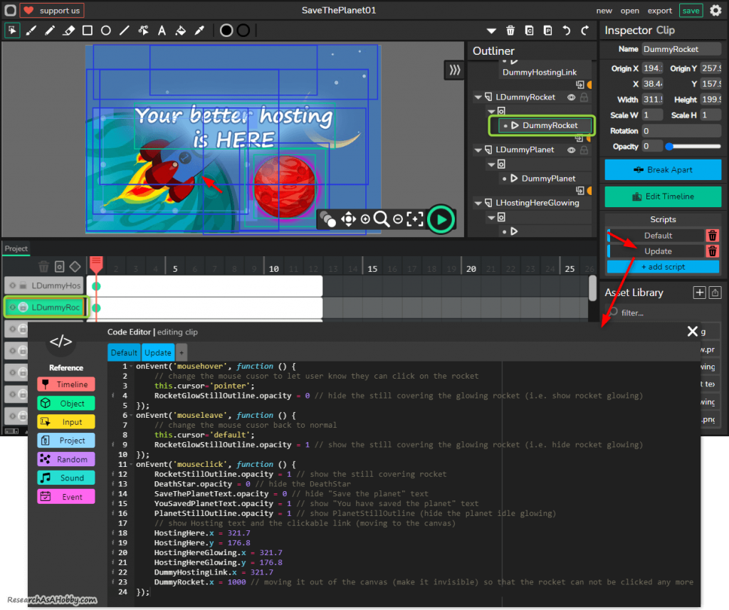
Interaction with the rocket is similar to how it’s done with the planet. The script is provided in the DummyRocket element:
There are comments in the screenshot above, so I guess it’s more or less clear what I do there. In short:
- When user moves mouse over the rocket (i.e. over the DummyRocket element), the element “RocketGlowStillOutline” becomes hidden, and so the yellow glowing rocket (element RocketGlow which gives us the yellow glow) becomes visible. So with the mouse over, there are two animations become visible at the same time: both with purple color (I call it idle animation – the layer LRocketIdleGlowing) and the yellow color animation (layer LRocketGlow). Alos, the cursor turns from a default one to a clicking one.
- When user moves mouse out of the rocket, the element “RocketGlowStillOutline” becomes visible again and it covers the yellow glowing animation, leaving just an idle (purple) animation of the rocket. Also, the cursor turns into a default one.
- When user clicks the rocket, a bunch of simple things happen. Thelement RocketStillOutline becomes visible which covers all the rocket animations (the rocket becomes still like on the background image). DeathStar becomes invisible and the overlay with a normal planet becomes visible (user saved the planet!). Also, previous text image (“save the planet”) is replaced with a new one (“You saved the planet”). And the interactable text images (“Your better hosting is here”) appears (they move into the canvas). At the same time the clickable rocket element (DummyRocket) moves away from the canvas.
Text image interaction
At this stage there are no animations visible. Both planet and rocket animations are covered by the still images, so the animations sort of run under the overlays. And the only thing a user can do is to interact with the text image composition “Your better hosting is here”.
The text composition consists of two images with the text “Your better hosting is here” (see the list of assets). The first layer is static, and another one is activated (becomes visible) when a user hovers a mouse over the dummy element which is located above these two layers.
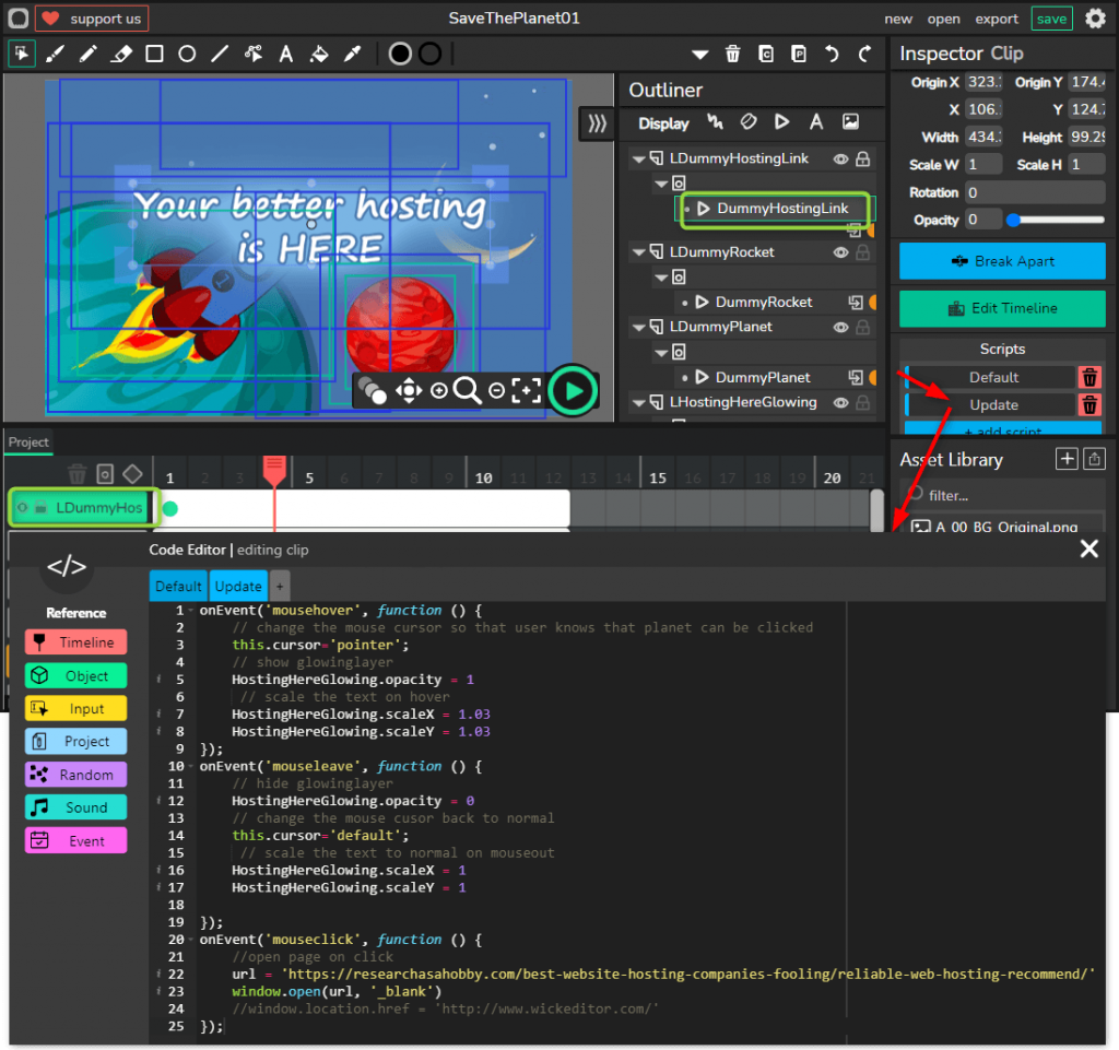
Let’s have a look at the code for this dummy element:
The code is pretty simple. I’ve added comments in the code, but anyway here’s a short description:
- When user moves a mouse over the “hosting text” area (“mousehover” event), the cursor changes on a clickable one. Also, The second layer (“HostingHereGlowing”) with the text image appears and increases in size a bit to emphasize interaction effect.
- When user move the mouse off the area, the second layer becomes invisible, cursor gets back not a default state, and the second layer gets back to its default size.
- When user clicks in the area, the new window tab opens with my page where I recommend hosts for different types of users (you can have a look at this page, if you are looking for a new hosting by any chance).
That finalizes my Wickeditor project which acts like a small game with a little marketing plug at the end.
The only thing left is to embed the game in the web page. See the next section about it.
Embedding Wickeditor project on your web page
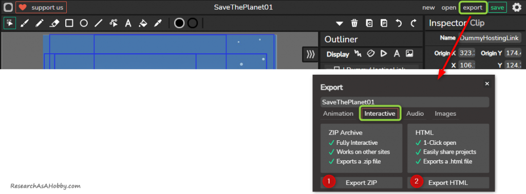
Wickeditor allows exporting to a number of formats. In my case I need export of an interactive type. It’s a html/css/js type of export that can be delivered either in a number of zipped files (option 1 in the image below) or just in one HTML file (option 2). It’s up to you what method to choose. If you want to embed the project into WordPress site or share with someone, then I think it’s easier to choose option 2 (one HTML file). But both options can go.
Here’s how you export in Wickeditor:
So, let’s say you exported into HTML file. Now you just need to embed it on your web page using <iframe> tag.
In order to do it, first you need to save the exported file on your server.
For example, I’ve put my file (“SaveThePlanet01.html”) into “public_html/shared/” folder on my server:
And here’s the code to add to your web page, the code specifies the width and the height of your project that you want to display (in my case it’s 640 px wide and 407 px high):
<iframe src = "/shared/SaveThePlanet01.html"  width = "640" height = "407">

Sorry your browser does not support inline frames.

</iframe>
This concludes the tutorial.
Some behind-the-curtain notes
Although I’ve already shared some of the side thoughts with you about using Wickeditor in this and my two previous articles about it (see 1 and 2), I’d like to underline the most important ones here.
I’ve found out that Wickeditor is a very promising tool for creating animated and interactive things that even beginner users can deal with. I don’t know any other tool that can allow you doing something of this complexity and that easy considering animation and interactive experience. Moreover, it’s a free tool.
On a disadvantage side, I think that the tool is not super intuitive from some perspective (at least, I could not do what I wanted without watching several tutorials LOL). Perhaps this is partly because this is how the complexity of the features meets the simplified user interface. But after grasping key principles and concepts of the tool, it becomes OK to work with it.
Also, I’ve got a feeling that not everything may work as a user may expect it. I believe this is because the tool in the development phase. Anyway, this is all fine and more than acceptable.
The biggest disadvantage of Wickeditor for me, is that unlike SVG approach (here’s one of my tuts on it), it does not create scalable projects. I.e. your project has a specific width and height which do not adapt automatically to the size of your page. Perhaps I want too much, but I’m sharing my thoughts, why not? 🙂
After all, I was impressed with Wickeditor and recommend using it for you needs.





This has been by far the best article on Wick Editor i ever read. I must say i am new to javascripting but have since learnt a great deal using this tool which unfortunalely seems stalled and one can no longer register an account to join the community to ask questions.
However, through reading existing comments i could manage to build an interactive multi page website with several interactive or clickable templates but have been struggling to animate objects with code without the need of tweening and still on the look out for a better work around.
Thank you so so much for this wonderful article, i will indeed take time and re-read it as it is the best thing i have come across thus far related to Wick Editor.
Glad you found the article useful!